New Hire Experience
Engaging new employees with a human approach
2018/06/01
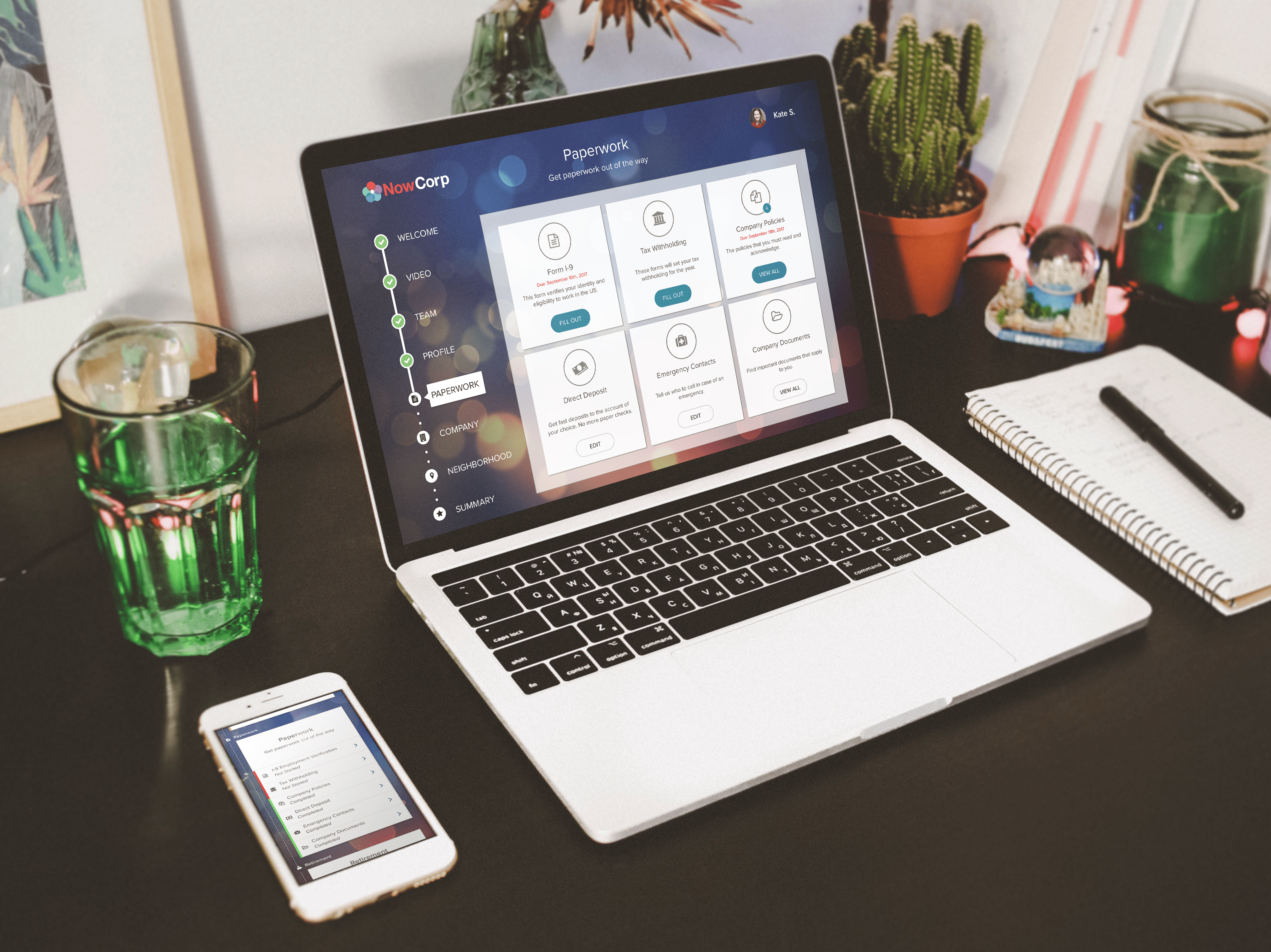
My Role
For 2017, I was the designer on the Onboarding team, responsible for understanding the needs of new employees and delivering the experience for new hires.
DISCOVERY & CONCEPT
I worked with the product manager, developers, and a UX researcher to generate insights and create concepts to address customer needs.
DESIGN EXECUTION & ITERATION
I worked closely with my scrum teams to deliver wireframes, flows, and prototypes to execute features, as well as with a UX researcher to test, iterate, and refine the design before going to engineering.
THE PROBLEM TO SOLVE
WHEN CAN I START?
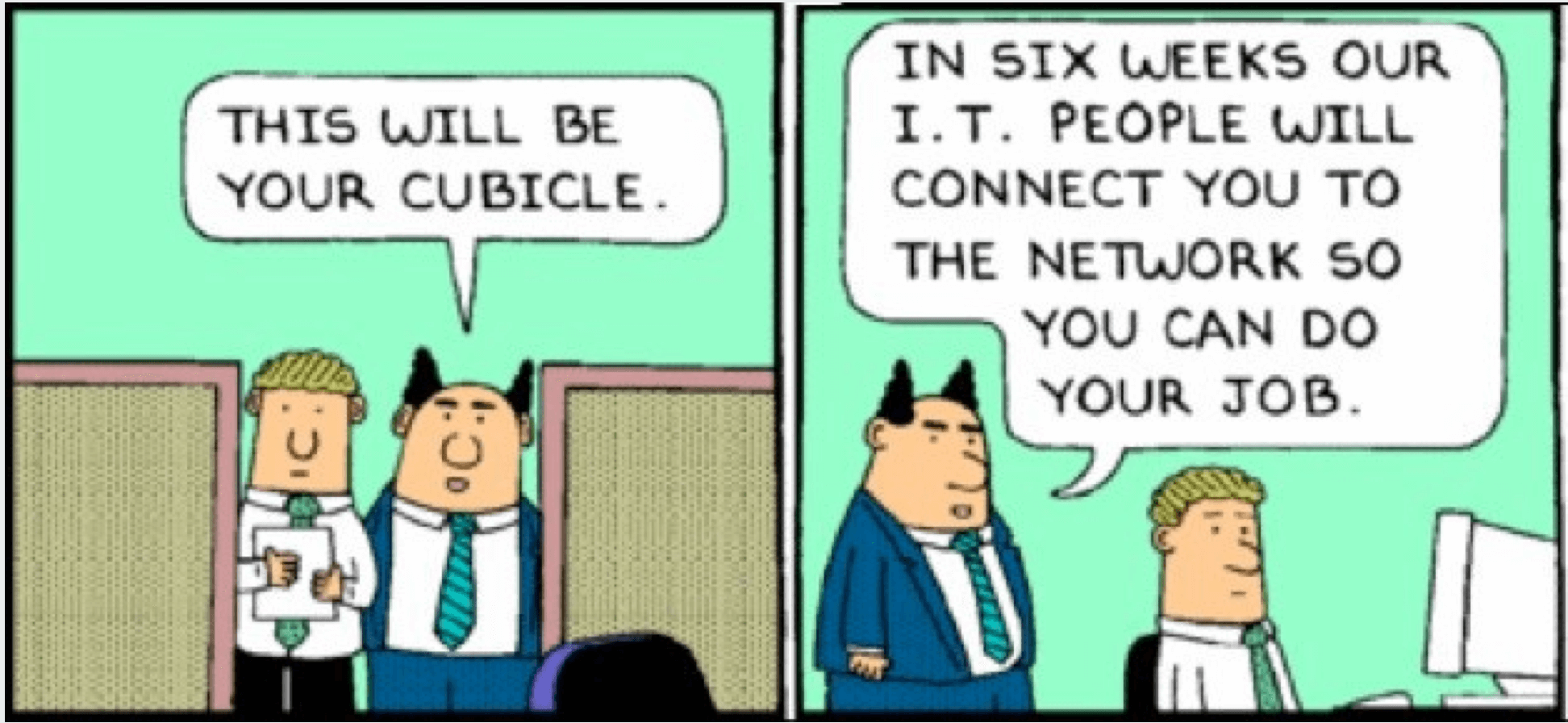
Starting a new job is a significant change. We want to make it easier. Nothing stalls productivity like showing up for the first day of work and not actually being able to do anything because the logistics aren't set up or there's tons of onboarding paperwork to do.
How might we make the onboarding process more efficient and insightful?
THE DISCOVERY
USER INSIGHTS
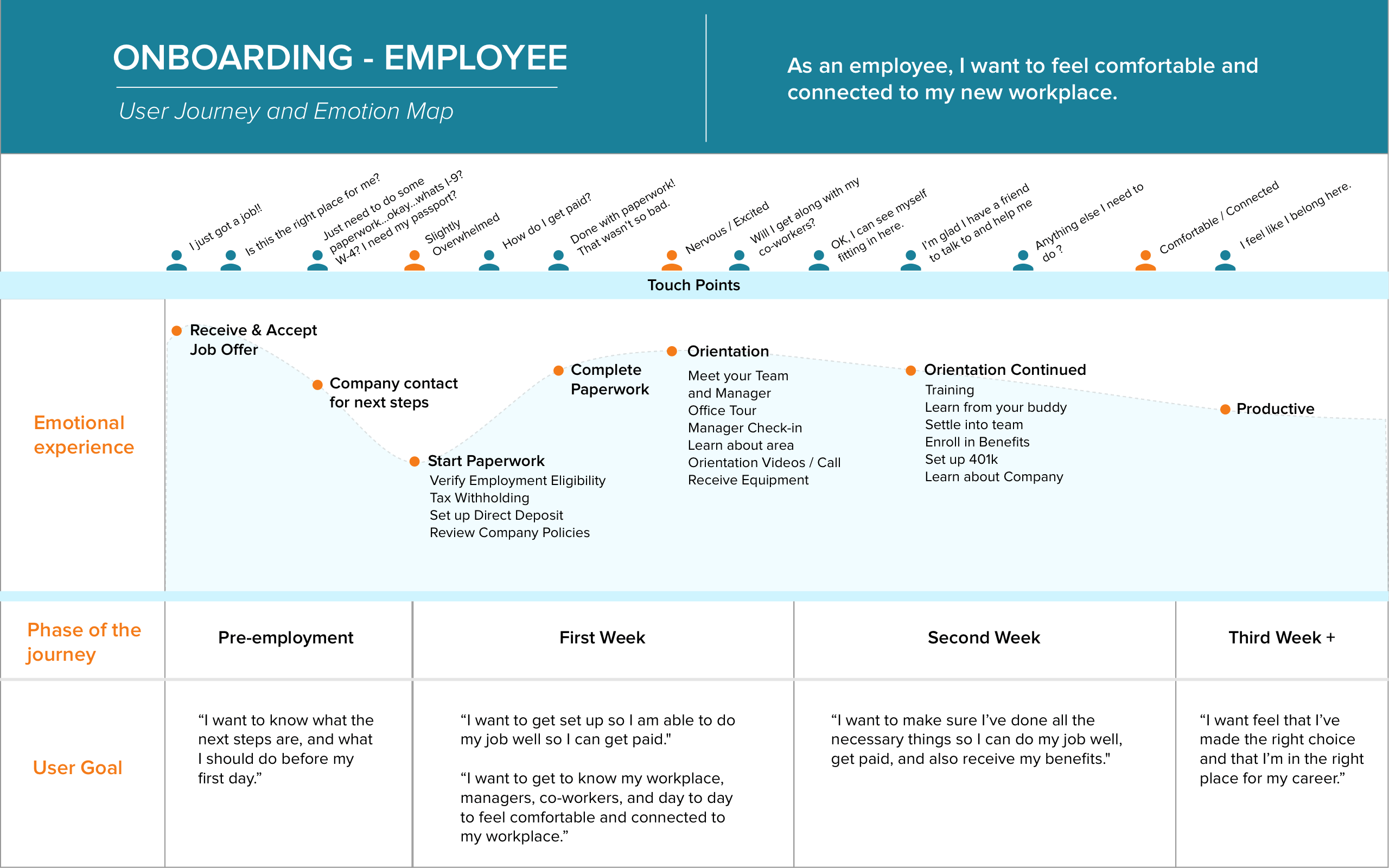
To get a better picture of new employees, I went onsite to one of our clients to observe their onboarding process, and extrapolated out a generalized user journey. We also did exploratory research sessions on both employees and practitioners, which yielded the following insights:
Operational Inefficiencies
one in two HR practitioners felt their onboarding process was “somewhat structured” to “not-at-all” structured.
Get Comfortable
New Hires are anxious their first day of work and want to feel like everythings okay.
Culture Hacking
Practitioners and managers want to share their company culture and way of doing things with their new hires.
Spark a Connection
Both new hires and managers want to build a relationship with each other and the company.
Compliance, Compliance
Managers and practitioners need to ensure that the new hires complete the required paperwork.
Time Sensitive Paperwork
Some paperwork, such as Form I-9, must be completed in a set time frame or else new hires are not able to work.
THE VISION
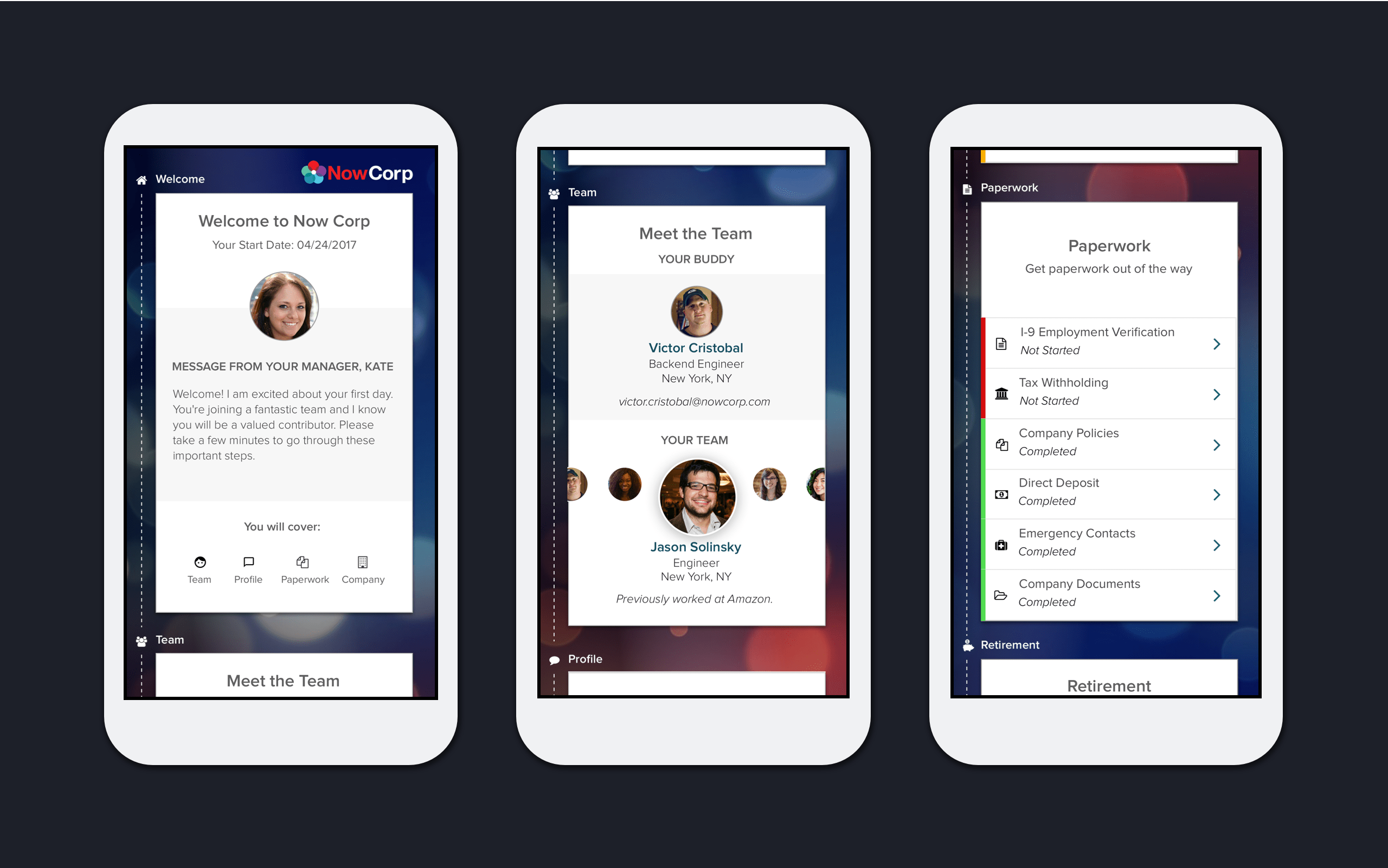
Seamless Paperwork
COMMUNICATING DESIGN
KPIs for a Common Language
Our product team would say things like:
- "We should do it more like TurboTax does"
- "I think it looks better this way"
- "I know users will want this information"
- "Users don't do this on mobile"
- We needed a way to cut through the noise and focus the conversation on common outcomes.
We used UX KPIs to align on feature objectives and to measure how a specific feature achieves its strategic and functional goals over time. The three qualitative KPIs we chose were:
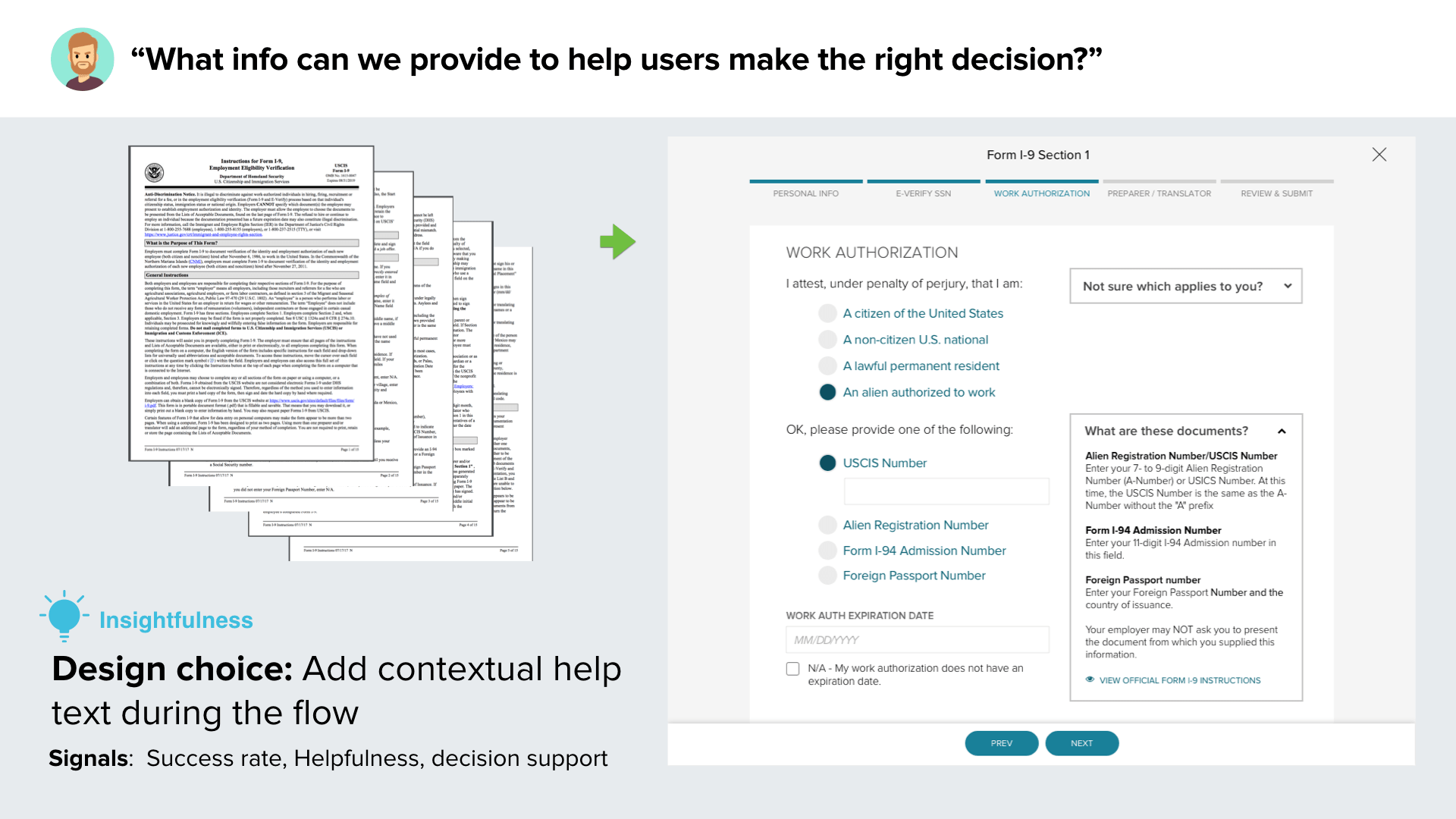
Insightfulness
Does this help you make a decision?
How helpful the information provided to the user is in making decisions.
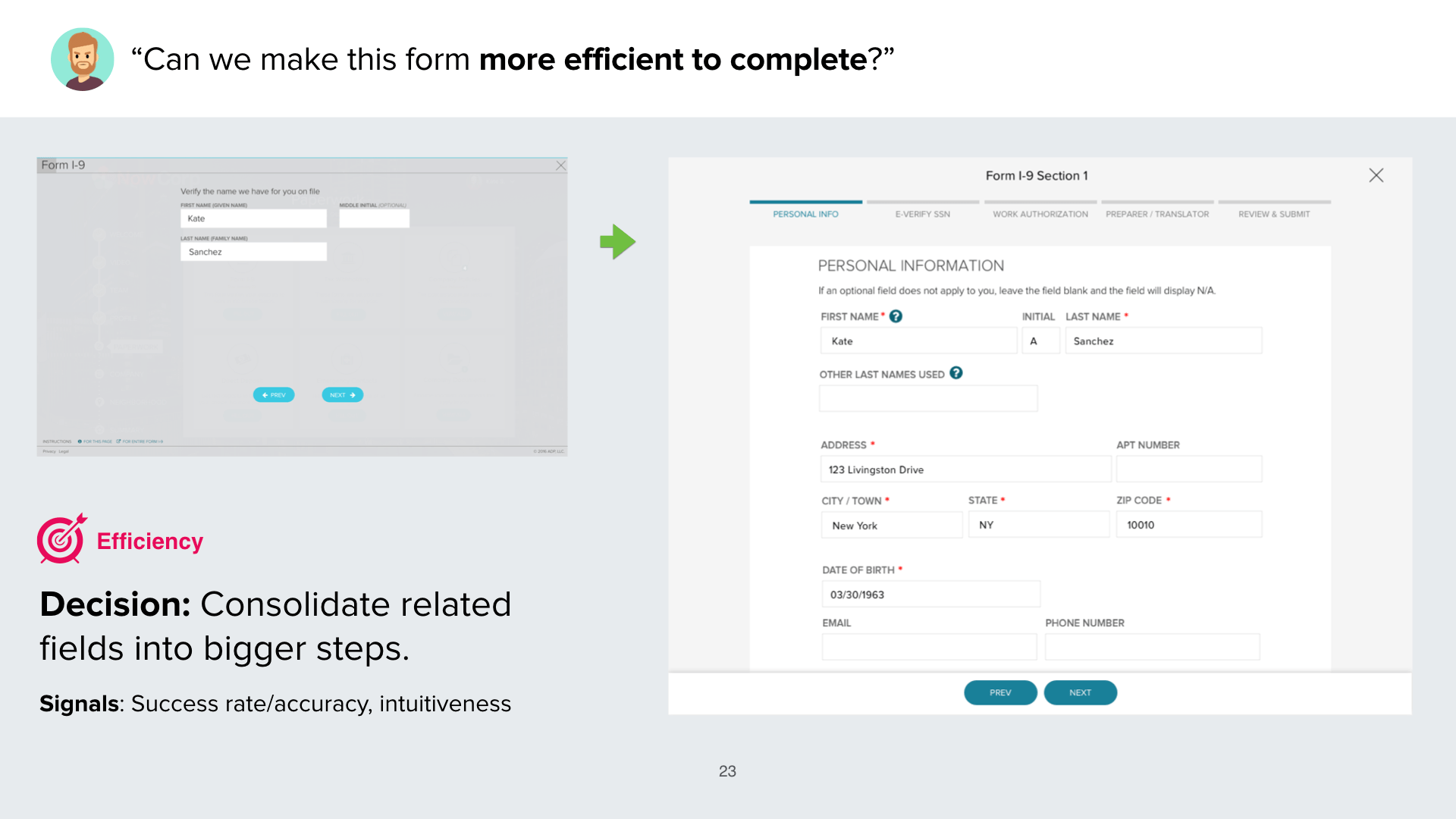
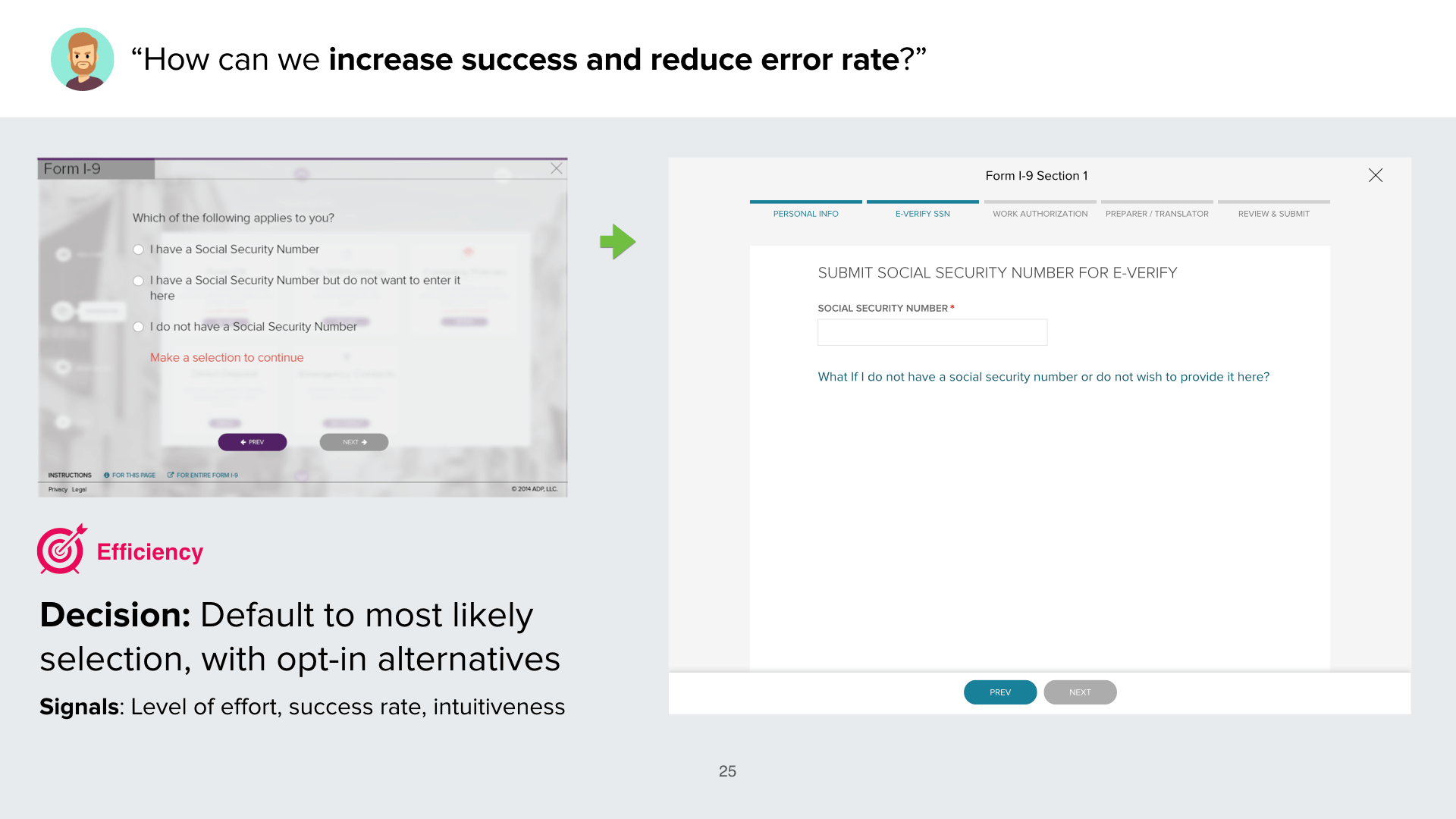
Efficiency
Was it clear, fast, and easy?
How much time, effort and training is required to successfully complete a task.
Usefulness
Was it useful? Will you use it again?
How many users have opted to use a feature within a given time period.
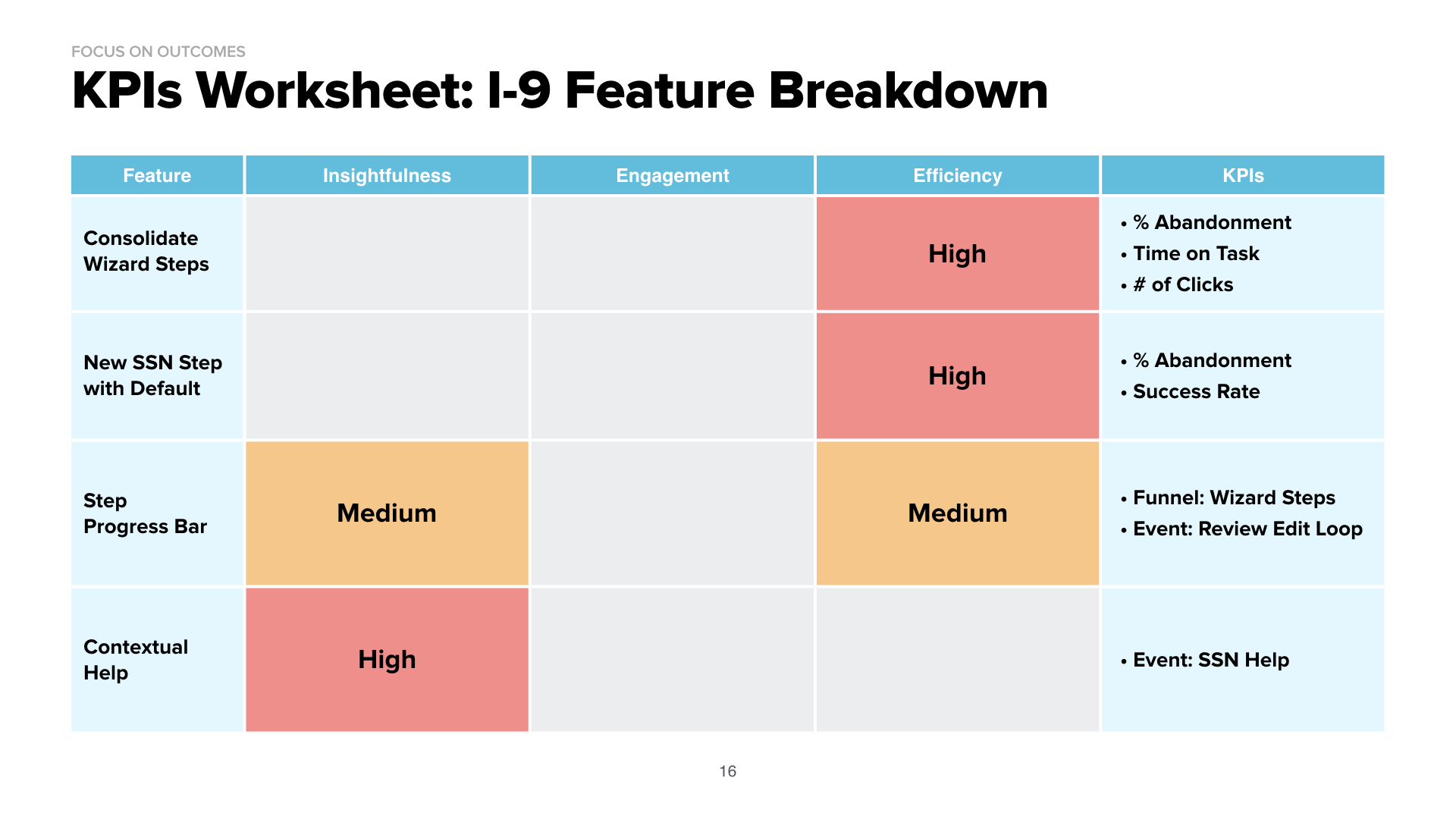
Now we changed the conversation to a common objective:
- "Can we make this form more efficient to complete"
- "How can we reduce error rate"
- "Users are getting stuck here, how might we help users make the right decision"
- "How can mobile make paperwork more efficient?"
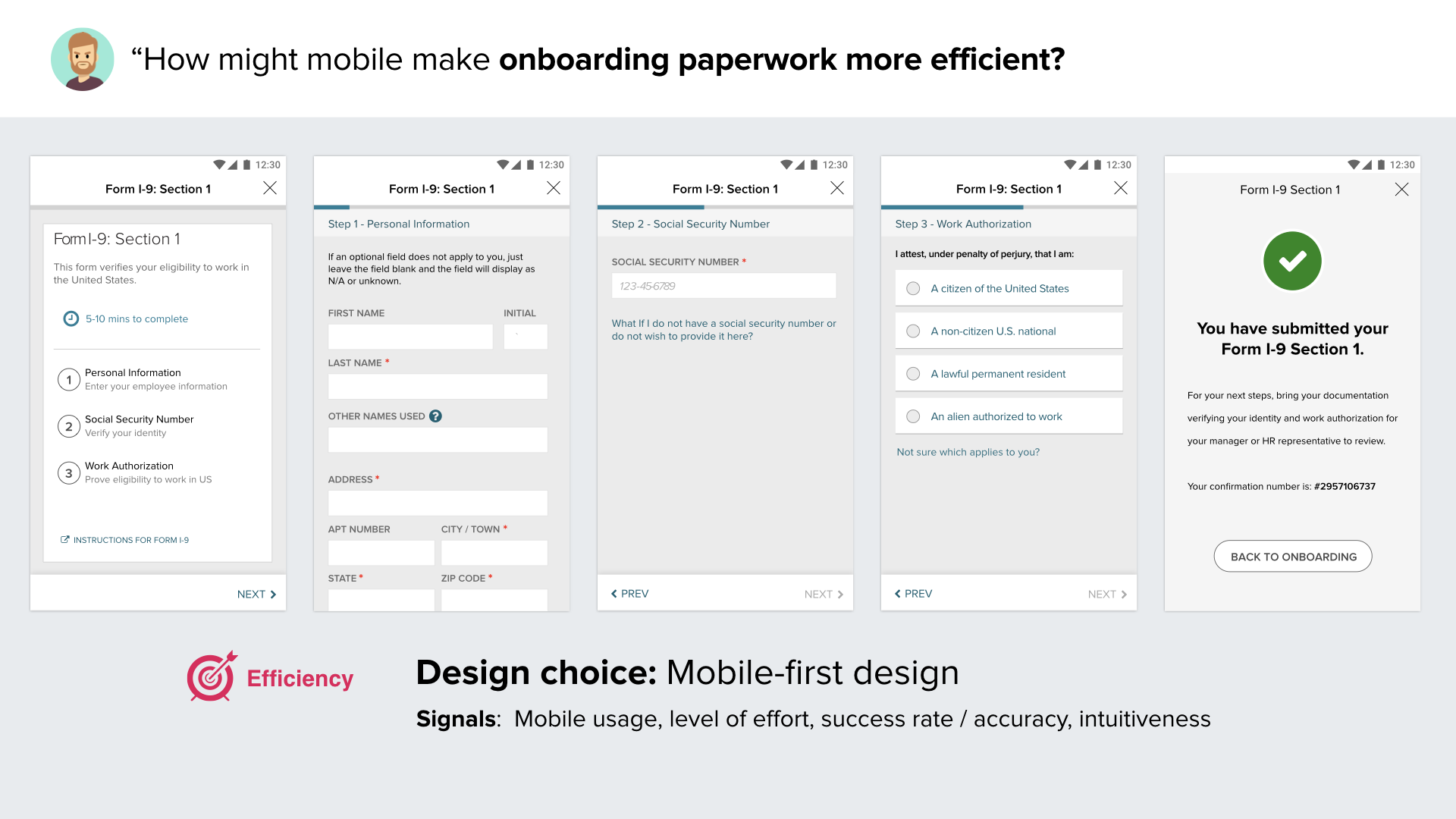
Key Outcomes
Reduced average time on task by ~5 min (33%)
Simplified number of states in flow from 40 to 25
Reduced average number of clicks to completion by 30%