Evernote Usability Testing
Task analysis user research
2016/05/22
I ran a usability test to uncover pain points in Evernote’s reminder feature on mobile and provide a design suggestion.
Objective
Identify pain points in using Reminders in Evernote for Android.
Target Audience
People aged 18–35 who used Evernote Basic (free) or Premium (paid) and were either working professionals or students. This group had all previously used Evernote or another note taking app on mobile as a key storage of information. Since Evernote markets the core benefit as being a “second brain” for people that need to remember things, I hypothesized that this sample group would be strongly representative of the target audience that Evernote would be interested in capturing. Moreover, it is estimated that Evernote generated $140 million and 70% of its total revenue from Premium subscriptions in 2015— most of which were people starting on the free Basic version who later converted to a Premium subscription.
Questions I wanted to answer
As Julie Zhuo, VP of Product Design at Facebook, once said:
If the problem is not clear or well-understood, you cannot > begin to evaluate how effective the solutions are.
I wanted to answer the following two questions:
- Can people easily create a note reminder?
- Do people understand how to use the reminder list?
Tasks
- Create a note (for a task or deadline)
- Set a reminder for the note
- Indicate task is complete (remove reminder)
For example: Go ahead and create a reminder for a grocery list. Then imagine you finished shopping and now want to indicate you’re done. I wanted to frame the scenarios as open-ended as possible to avoid influencing user behavior.
User Feedback
I organized the results from the usability test by ascending frequency of response, as well as categorized them into four distinct components.
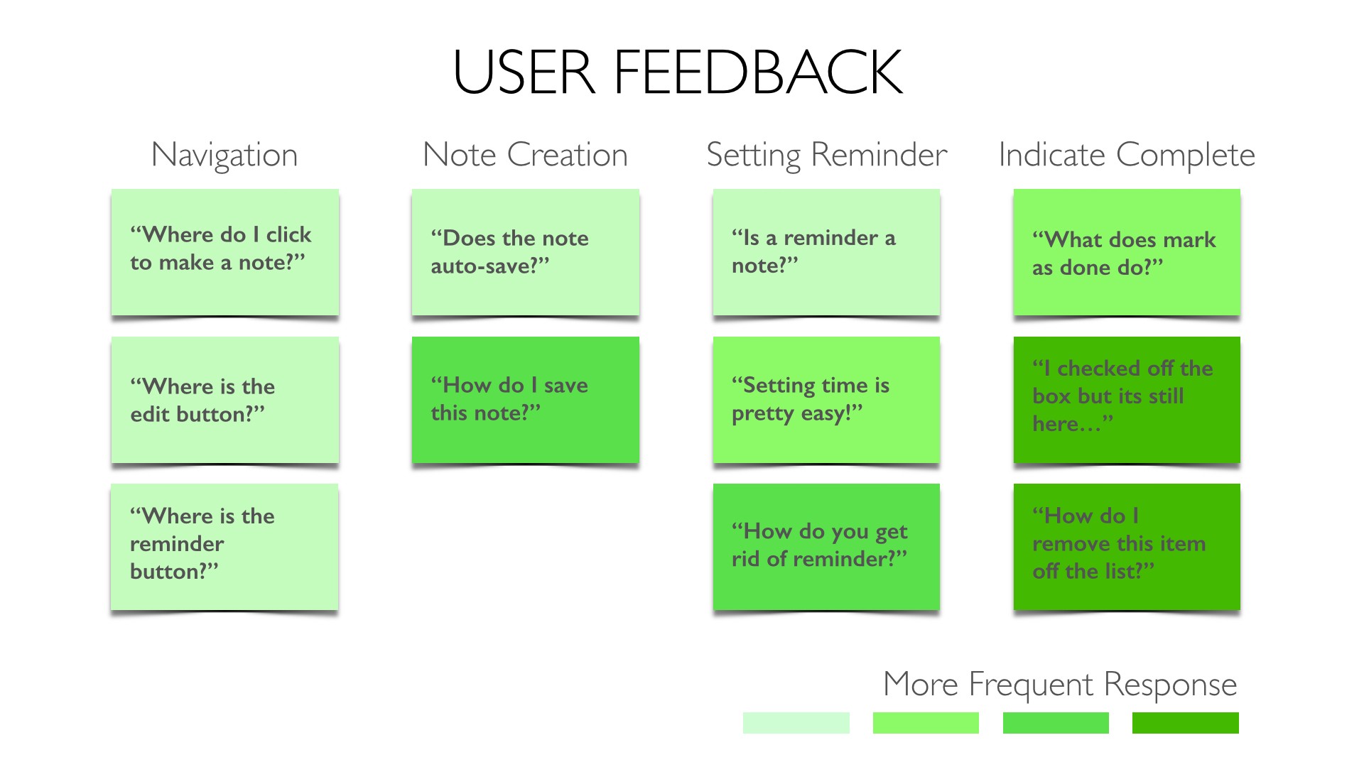
I then prioritized the usability issues based on how impactful it would be to both the end user and on Evernote’s bottom line.
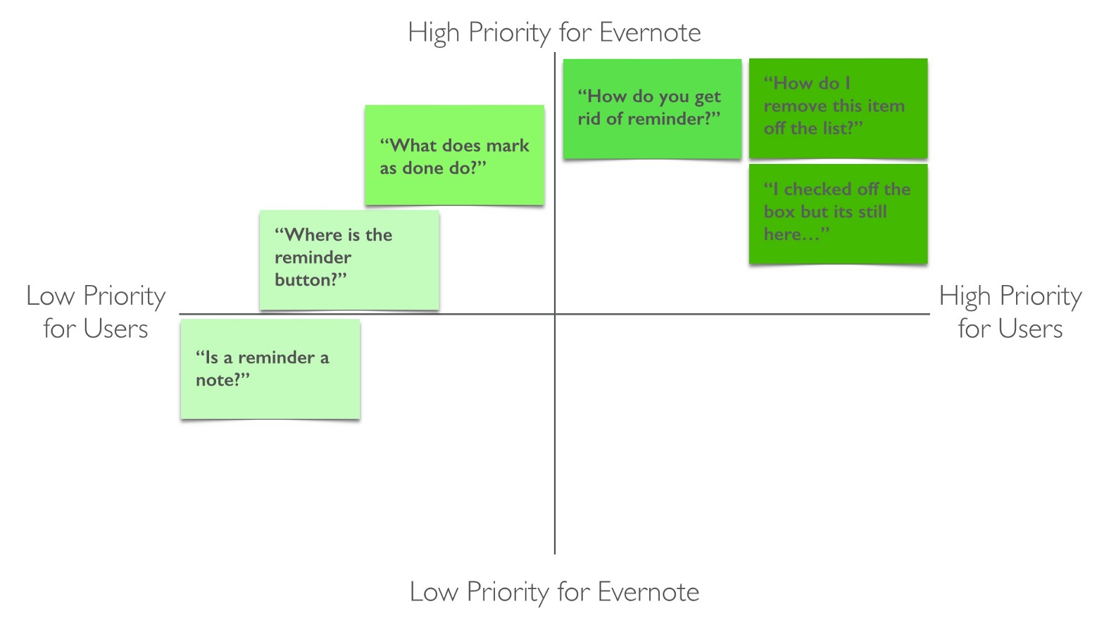
Key Findings
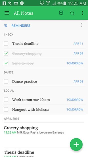
Reminders
Users had difficulty removing reminders from the reminders list.
“How do I remove this item off the list?”
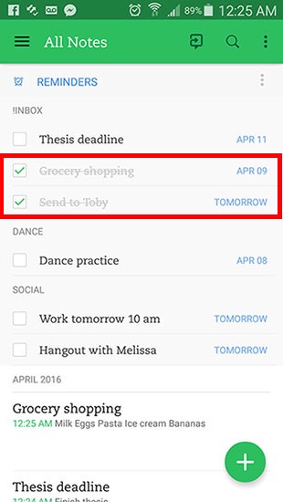
The most prevalent usability problem was in removing a reminder after completing the task — people expected the reminder to go away after checking it off. Instead, the item is checked and text greyed out with a strikethrough, but remains unmoved. Most people tried repeatedly unchecking it, and could not figure out how to get rid of the reminder. Many people tried to swipe left to delete.
Eventually some people finally found how to remove the reminder by clicking into the note, clicking the reminder icon, and finding [Clear Reminder].
RECOMMENDATION: Allow people to remove a reminder the way they expect to. Implement a [swipe left / right] interaction on each reminder option that enables people to remove the reminder. Additionally, allow an undo if it was done by mistake. This would leverage an existing recognizable interaction pattern that people are familiar with, and be efficient in reducing a three-click interaction to one swipe.
Users expected “Mark as done” to remove from reminders list.
“What does ‘Mark as done’ do?” “I checked off the box but its still here…”
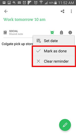
People were confused between the difference of ‘Mark as done’ vs. ‘Clear reminder’ and tried to click ‘Mark as done’ to clear reminder from list.
There is a certain need for differentiating between indicating a completed reminder and removing the reminder. However, I believe a large part of the confusion here stems from the fact that people could not initially find a way to remove the reminder, and thus believed ‘Mark as done’ would clear it. However, checking the checkbox serves the same purpose on the home screen, but there is no equivalent action to remove reminder.
Design Suggestion
Allow users to swipe left to remove a reminder from the reminder list, allowing people to intuitively remove reminders from their home screen with two fewer clicks.
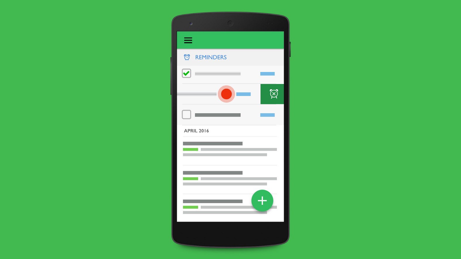 See prototype above for interaction design
Evernote is meant to reduce cognitive load by acting as a “second brain,” and has significant value in a seamless user experience. I believe implementing this interaction will have the biggest impact on Evernote’s bottom line, as it improves the experience for potential power users of Evernote — the people most likely to upgrade to Premium.
This usability test and design suggestion was done out of a love for both Evernote and UX design, and inspired by Raghav Haran and Francine Lee from their own usability tests. Major thanks to my design mentor carl collins.