Reinventing HR
Improving the way millions of hourly workers get paid
2019/06/01
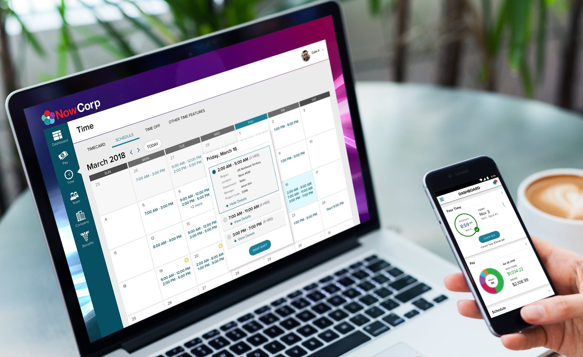
I was part of an ambitious project to create an intuitive, unified Time experience, helping millions of hourly workers get paid properly.
I have omitted confidential information in this case study. All information in this case study is either public knowledge or a re-imagination of my own and does not necessarily reflect the views of ADP.
My Role
For 2018, I was responsible for leading the design of new features and enhancements for the Time experience across Desktop, Mobile, Tablet, and Kiosk.
DISCOVERY & CONCEPT I worked with product managers, developers, and UX researchers across multiple scrum teams to generate insights and create concepts to address customer needs.
EXPERIENCE STRATEGY & VISION I focused on goals and outcomes of design by sharing prototypes, presentations, and frameworks to help drive decision making.
DESIGN EXECUTION & ITERATION I delivered wireframes, flows, and prototypes to execute features and supported scrum teams through production. I also worked with data to test, iterate, and refine designs.
LEADERSHIP I frequently presented case studies and processes to senior stakeholders, other teams, or at ADP wide forums. I conducted UX Seminars for designers across ADP.
THE GOAL
Convert Time into Money
For an hourly worker, time literally is money. The amount they bring home every pay period is directly related to the number of hours worked. For many workers, recording their hours is an inefficient or manual task. For many companies, getting an accurate record of an employee's hours worked is a cumbersome process as well.
Our goal was to facilitate the accurate and efficient entry of time, so that workers could get paid properly.
THE APPROACH AND CONSTRAINTS
Consumerize HR Upfront
Our new employee and manager self service (ESS & MSS) was built on a new front end stack, driven by APIs from various legacy back-end time systems. This strategy enabled us to go to market much faster, but also had a tremendous impact on the quality of the experience we could deliver.

DESIGN FOR THE 99%
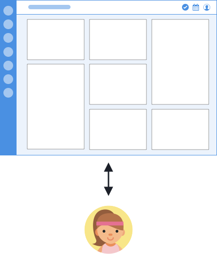
The strategy was to “consumerize HR” with employee and manager self service in mind, creating new mental models where needed, and optimizing for the mass market rather than a niche group of practitioners.
The goal was to break down product silos, create new universal mental models, and hide the system complexity of various back-end flows. This meant often facing pushback from practitioners, and leaning into our user research to test our hypotheses.
EMBEDDED INTO SCRUM AND CENTRALIZED
Our team had a hybrid of decentralized vs. centralized organization. Each designer was embedded on a product team with a triad, and also frequently met with the entire design team for standups, design reviews, and discussions to ensure a unified experience.
I worked closely with the Time product owner and engineers to execute features in the current and upcoming sprint, while concurrently working with other designers and stakeholders to plan future work and ensure system consistency.
THE DISCOVERY
User Insights
Together with a UX researcher, we conducted regular discovery, concept, and usability studies of 5-8 participants, as well as client site visits. Here are some key insights that drove design philosophy:
TIMESTAMP & TIMECARD EMPLOYEES
There are two major segments of hourly workers: those who clock in and out, and those who enter their hours on a timecard.
MICRO & MACRO MANAGERS
The primary manager segments are those who lean into making sure every single detail is correct, and those who don't really have time to do administrative managerial tasks.
ONE SIZE DOES NOT FIT ALL
An on-call nurse records time differently than a fitness instructor, expecting mother, or software engineer.
NO TIME FOR THIS
Despite time entry being a high stakes activity, both employees and managers try to minimize time spent in HR systems.
MISTAKES ARE COSTLY
Inaccurate time entries such as missed punches cause employees to be paid incorrectly and give managers more work to fix.
THE SEAMS ARE SHOWING
Users are frustrated when completing a time task requires switching between legacy and new systems.
FRAMING THE PROBLEM
Do More than Clock & View Pay
In its current state, our product was essentially a clock in/out button and (successful) pay stub visualizer. Over 80% of our usage was for the Pay feature.
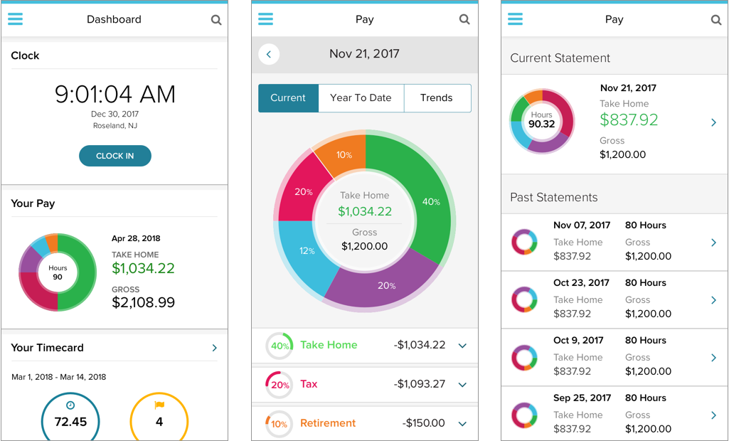
ADP Mobile App with Pay and basic Time
The reality was that employees and managers often had to manage a seperate legacy login to do more complex time workflows, such as requesting a leave of absence or approving a batch of timecards.
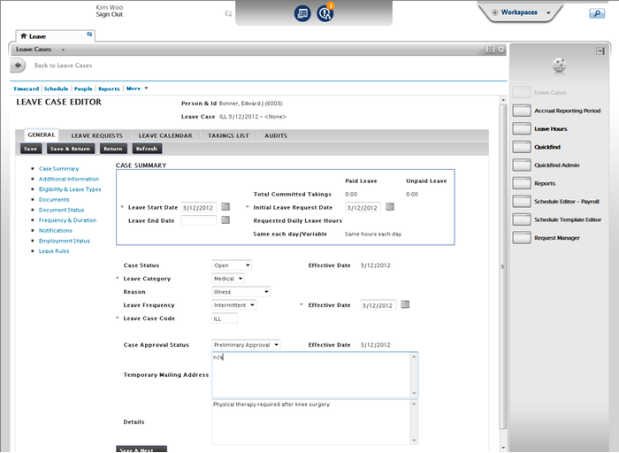
Requesting Leave via eTime, another ADP Time system
Even though these users wanted to switch to the new experience, they were forced to continue working in the older systems to complete their tasks.
Naturally, the question became: How might we enable employees and managers to complete their tasks?

The user adoption problem: our new experience was a "golden pier with broken ships"
Many fingers pointed to “feature parity” with legacy systems as a major need, and our PO had pressure to ship features ASAP. Chasing feature parity however wouldn't help us solve user problems any better than today's solution. I reframed the features my PO had planned as benefits for the user, and to think in terms of achieving outcomes. To quote Theodore Levitt, “People don’t want to buy a quarter-inch drill. They want a quarter-inch hole.”
| Feature | Job to be Done |
|---|---|
| Team Timecards (Manager) | Manager wants to efficiently approve all their employee's timecards |
| Schedule & Shift Swap (Employee) | Shift employee wants to view and modify their work hours |
| Total Absence Management Integration (Employee) | Employee needs to take time off for family, illness, or child birth |
Finally, we needed to identify the information architecture of how all these different time features would fit together.
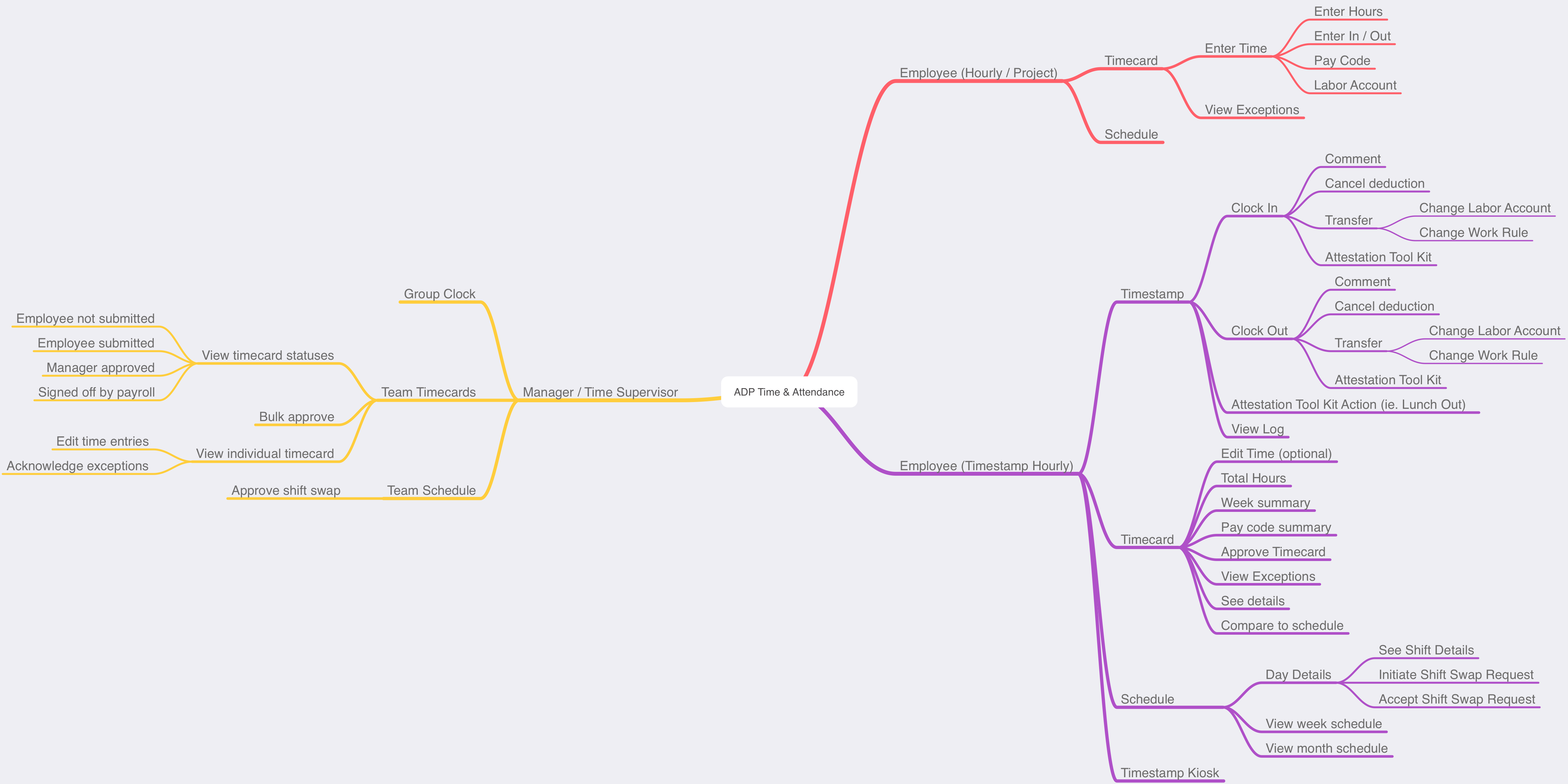
THE VISION
Plan, Enter, Review
To achieve our overarching goal of accurate and efficient time entry, I identified three main phases of the time entry process:
- Plan - When am I supposed to work?
- Enter - Record the time I worked
- Review - Check and approve the time I entered
As they say in economics, all models are wrong, but some are useful. This framework allowed us to organize features in the context of the user journey.
JTBD: PLAN
View and Modify Work Schedule
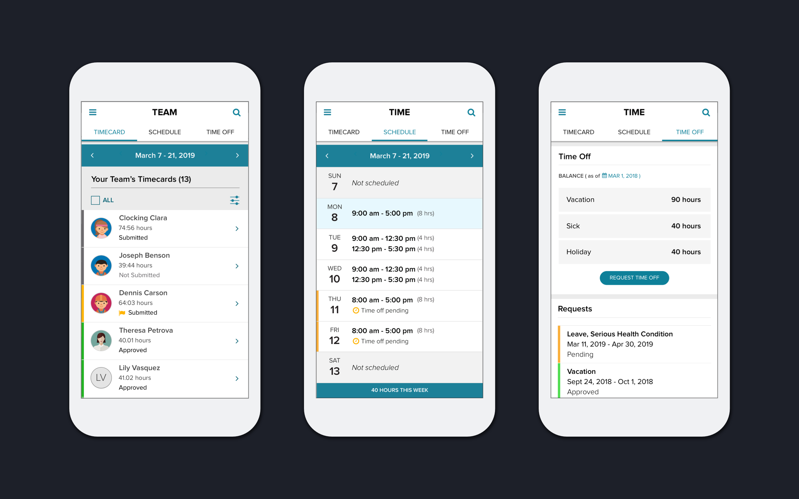
I designed a new Employee Schedule and Shift Swap based on a calendar to take advantage of the desktop form factor, that allowed employees to quickly see the hours they are scheduled, any transfers they might have, time off requests pending, and shift swap requests. The mobile experience would default to a week list view.
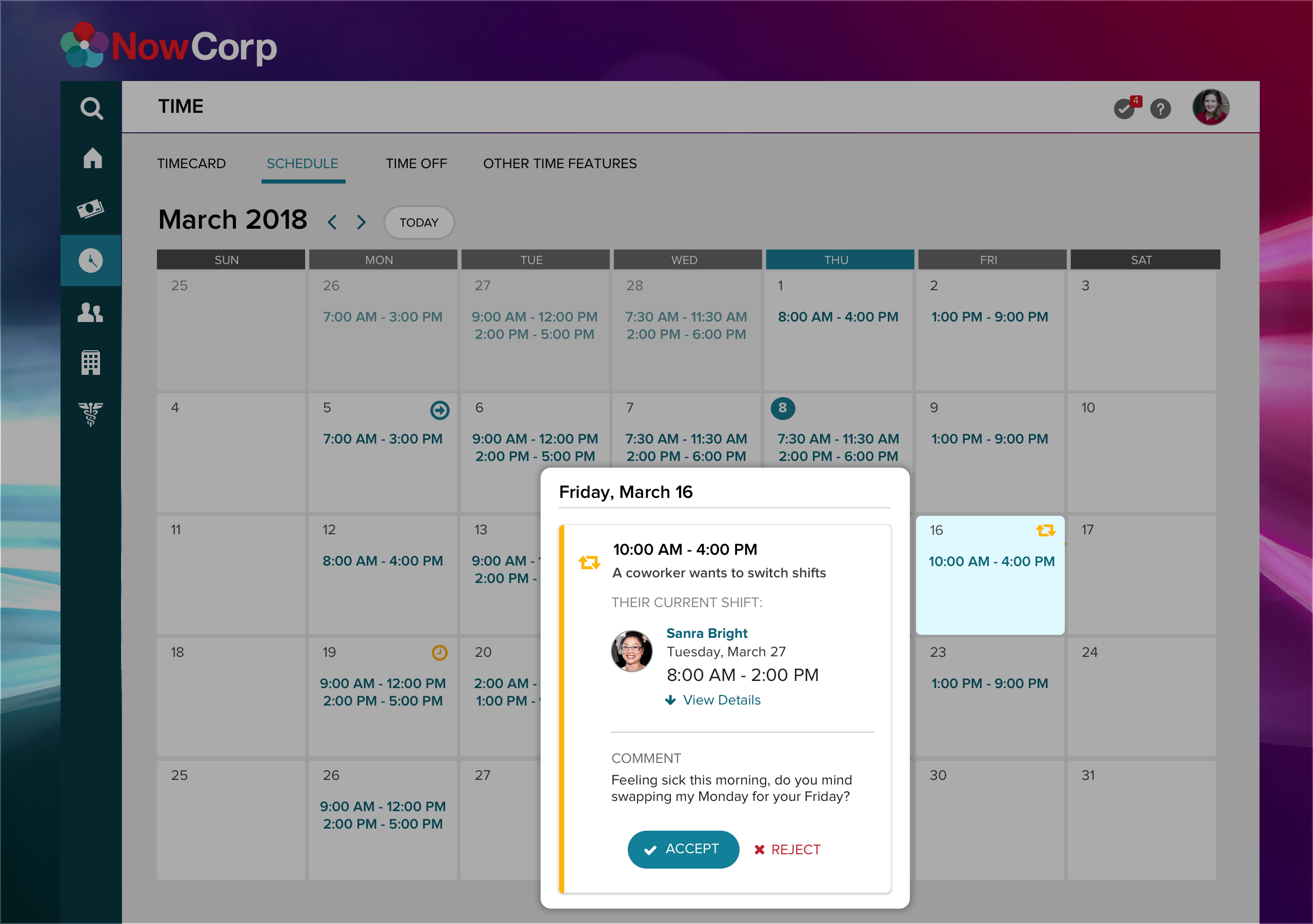
JTBD: PLAN
Take Leave of Absence
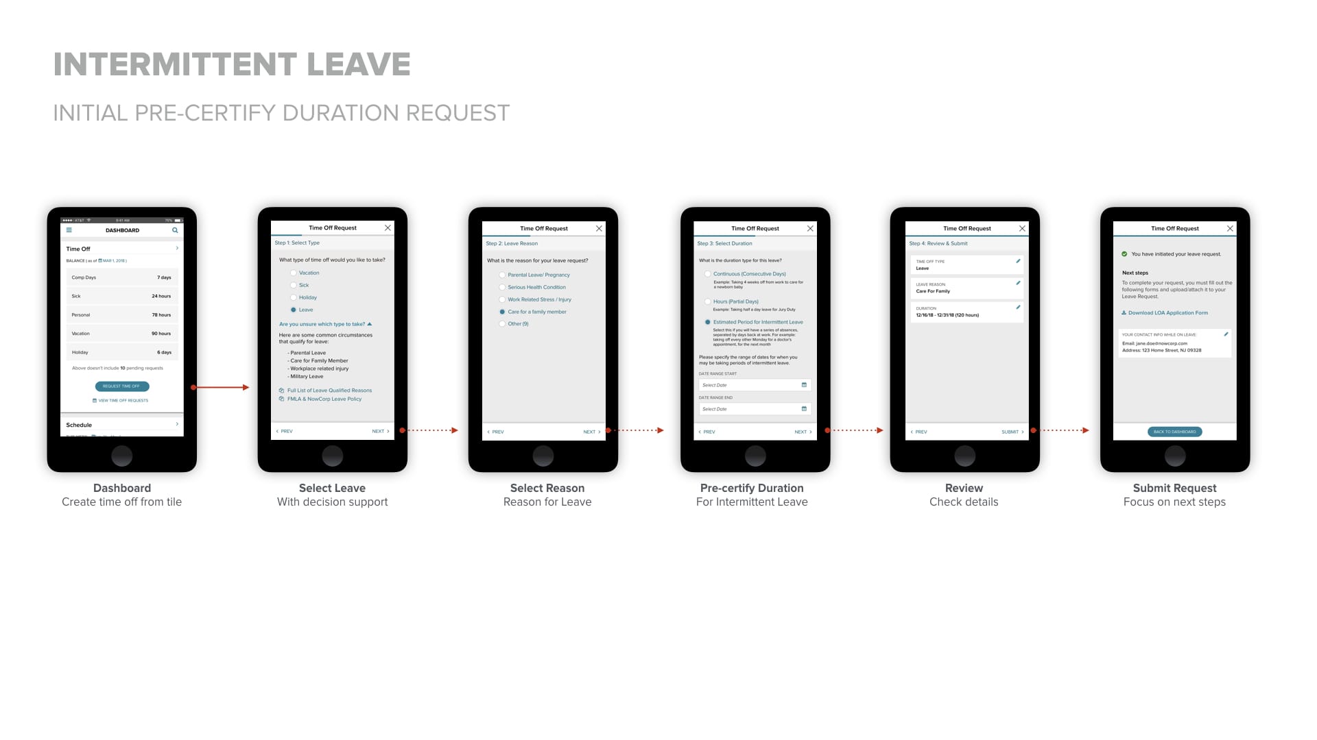
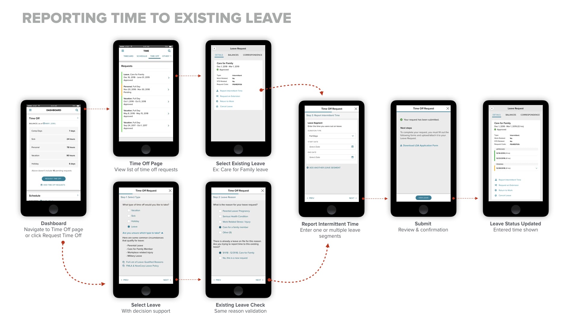
To eliminate the seam of having to request Leaves from another system, I worked closely with the PO and lead developer of the Leave team to design and coordinate a unified time off experience. Again we aimed to simplify the experience for a non-specialized user or practitioner, so we worked to eliminate system jargon and optimized flows for user journeys.
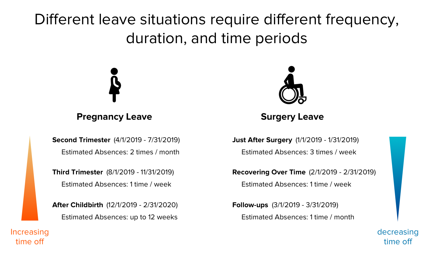
| Industry Jargon | User Centered Language |
|---|---|
| Continuous Duration | All at once |
| Intermittent Duration | Break it up |
| Precertified Intermittent Duration | Break it up, with estimated dates |
| Supplemental Frequency & Duration Deviation Cushion | Estimated absences |
| 2 episodes per interval, 4 hours per episode | 2 times / week, 4 hours each |
JTBD: ENTER
Efficient Time Entry
When it came to improving the clock tile, we had two major approaches -- focusing on the users next action or giving information about their current status. In both approaches, the previously prominent "current time" has been given less attention, due to the presence of clocks on computers and phones.
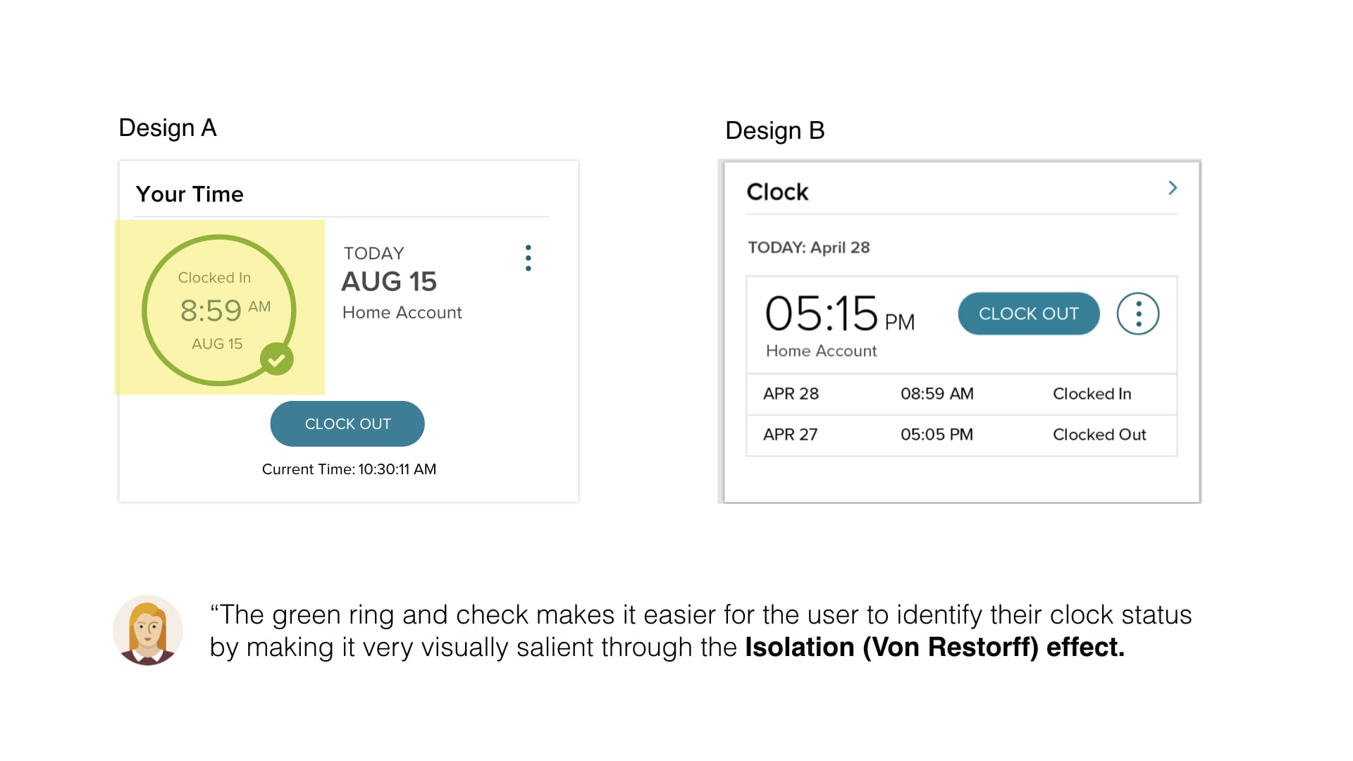
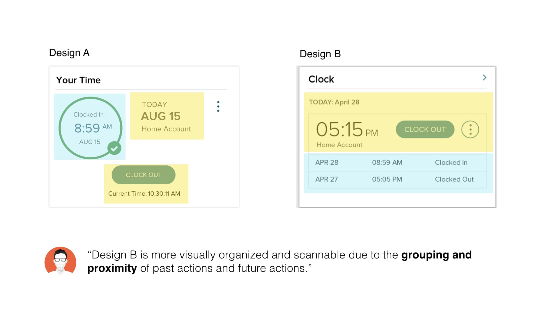
Tile designs in collaboration with Serafin Vazquez & Shayne Bowman
After a round of user testing, design A performed slightly better in terms of user comprehension. However, to truly get buy in on this new design, I had to figure out how to include all the necessary workflow actions into this tile:
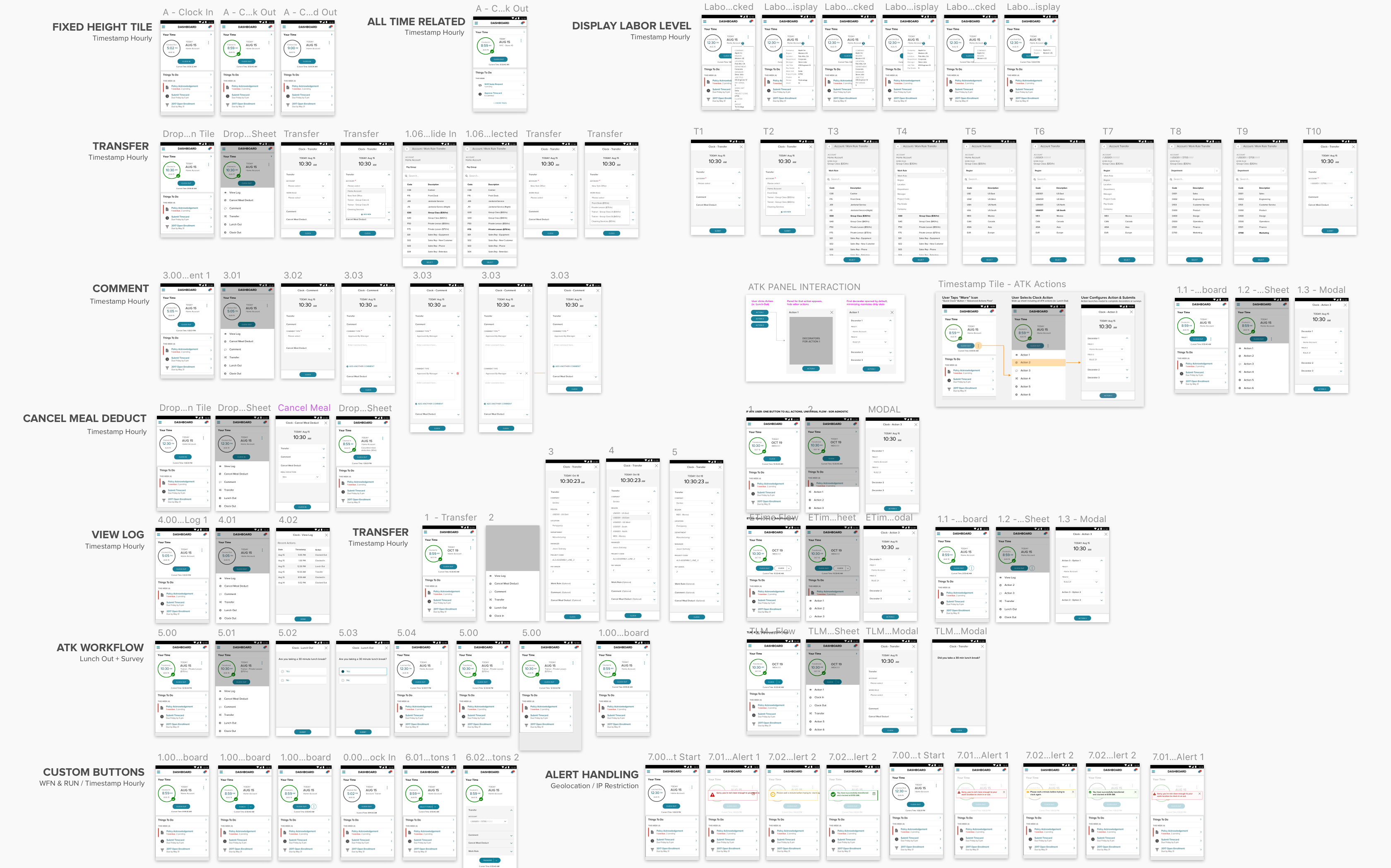
JTBD: REVIEW
Team Timecard Approval
The final step typically before an employee gets paid is for a manager to approve their employee's timecards to send to payroll. I designed a view for managers to quickly skim the hours, status, and breakdowns of their employees for a pay period, as well as performing bulk approvals for efficiency. For the more scrutinizng manager, they can also view the details of each timecard.
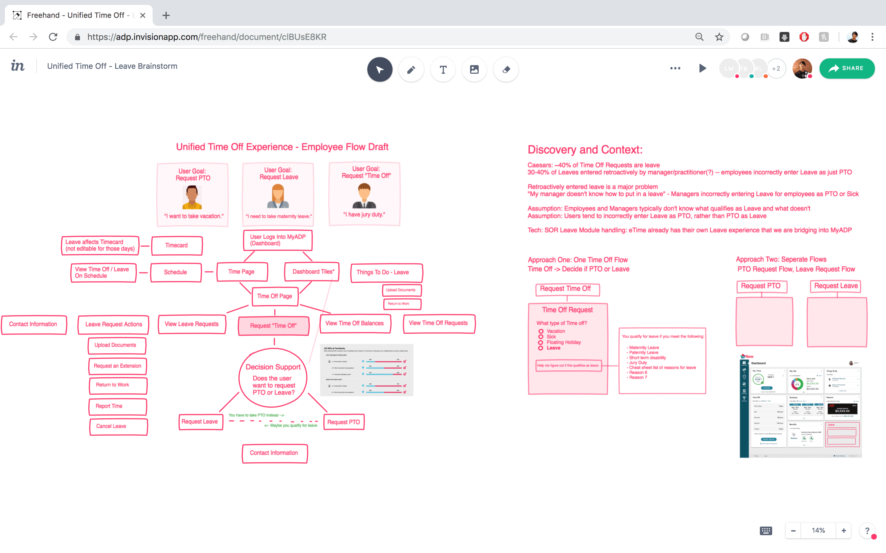 Brainstorming and whiteboarding
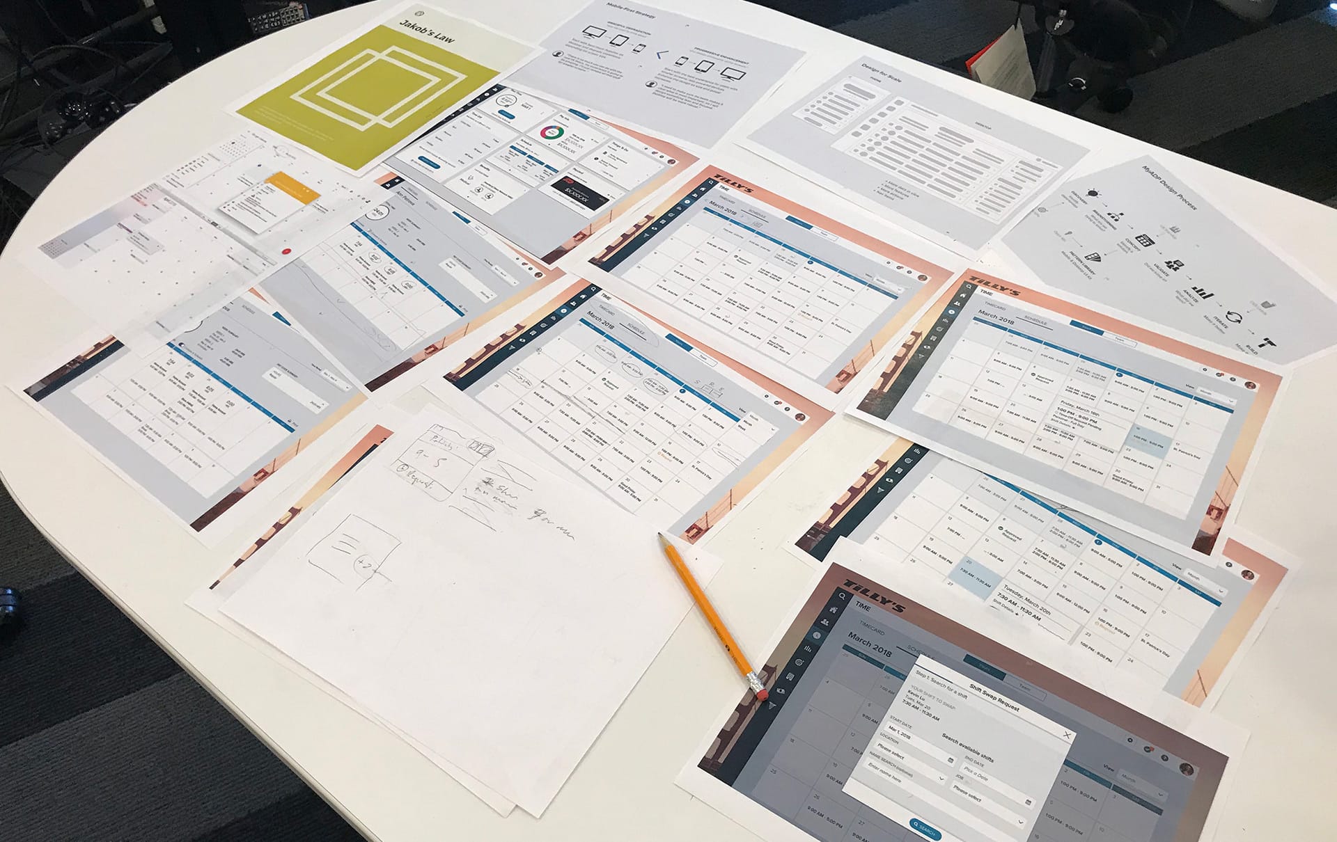 Design review and critique
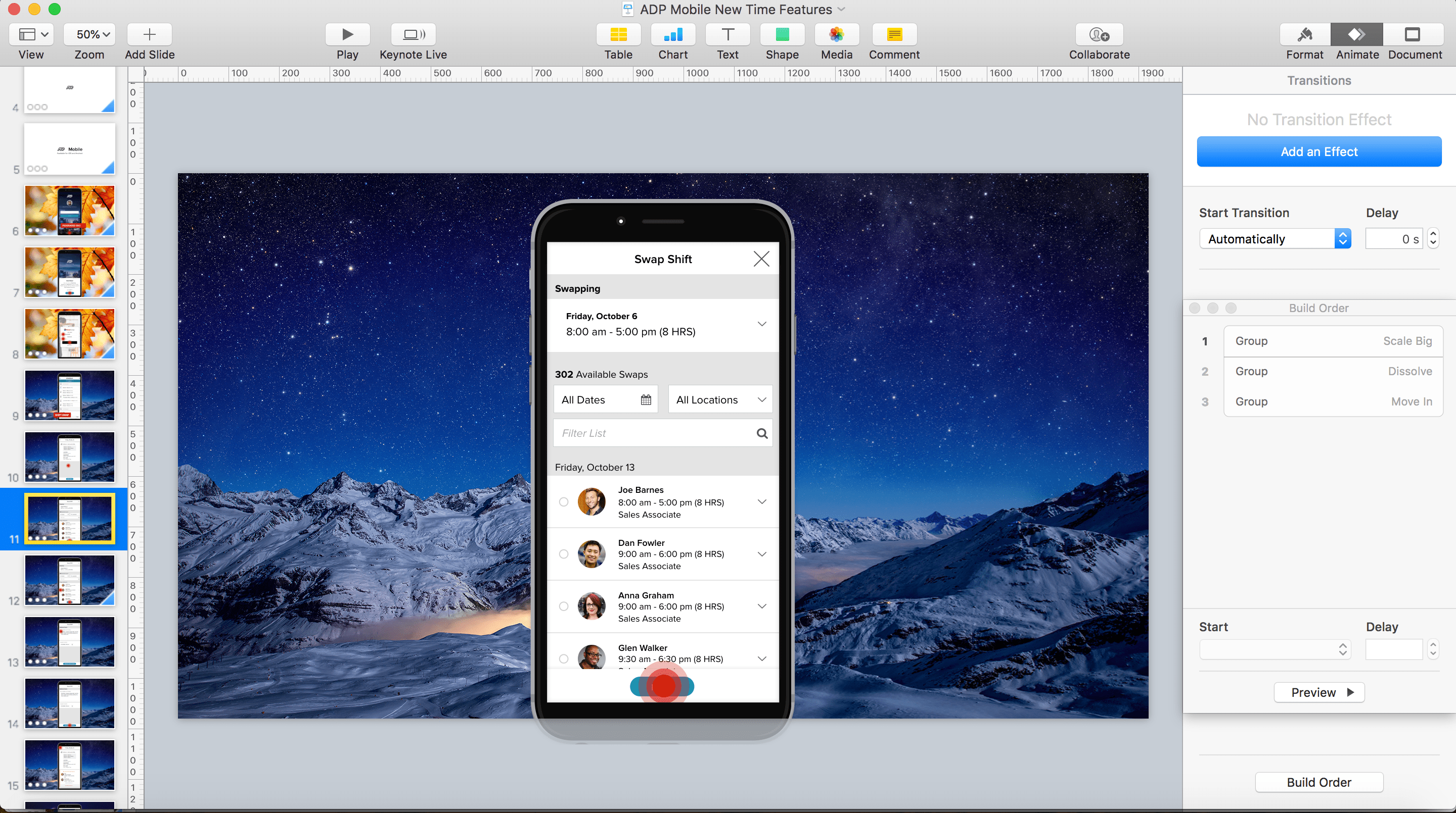 Vision video in Keynote
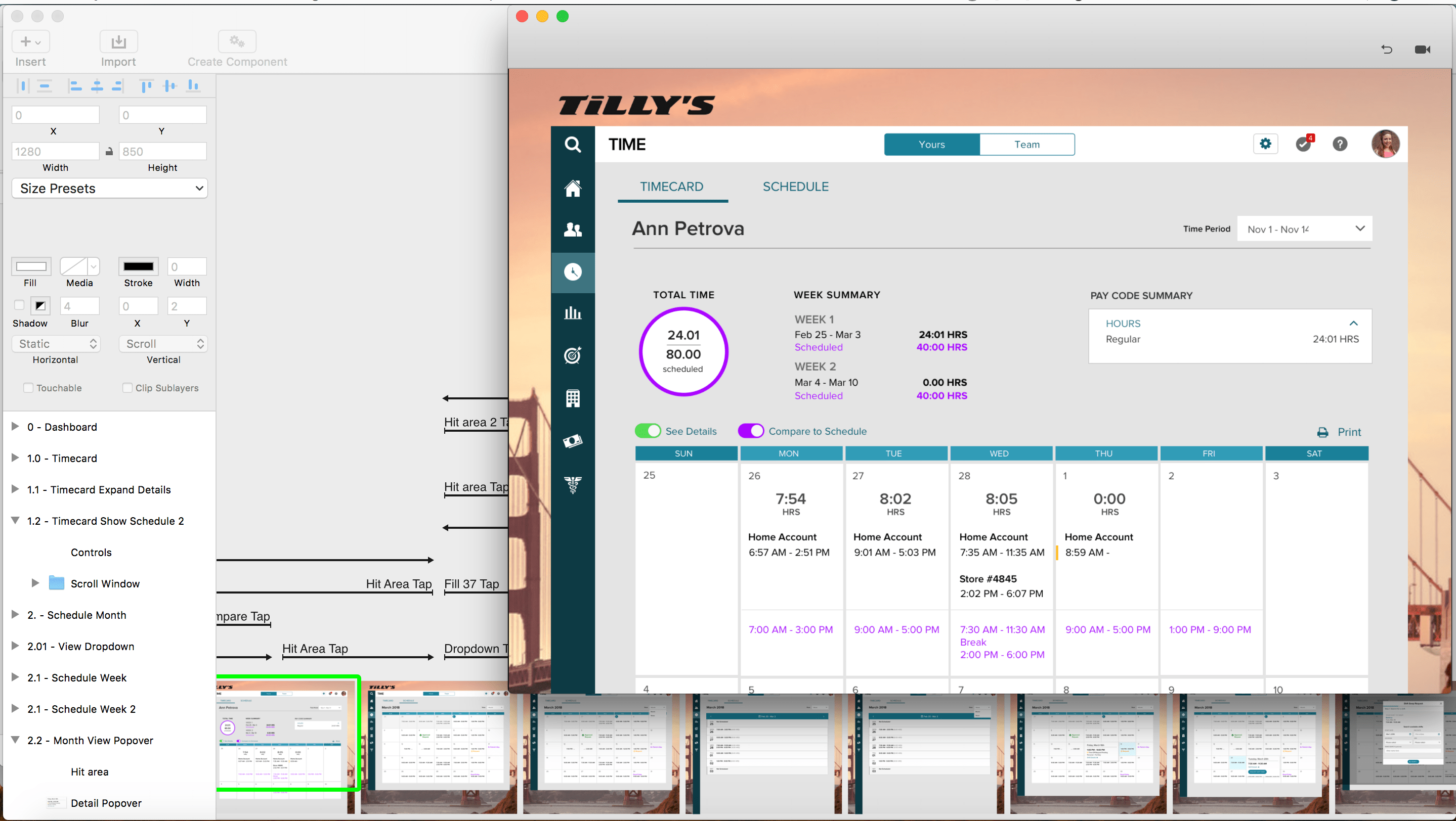 Prototyping in Principle
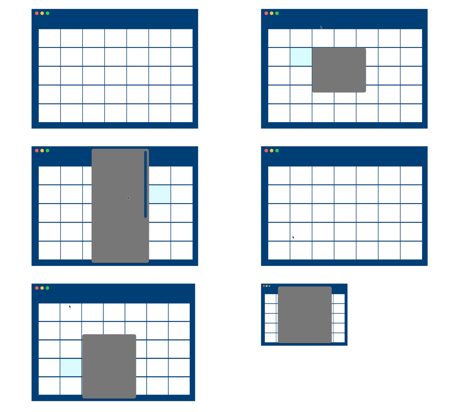
For detailed animations / interactions, I would sometimes provide small code snippets for the developer as a reference.
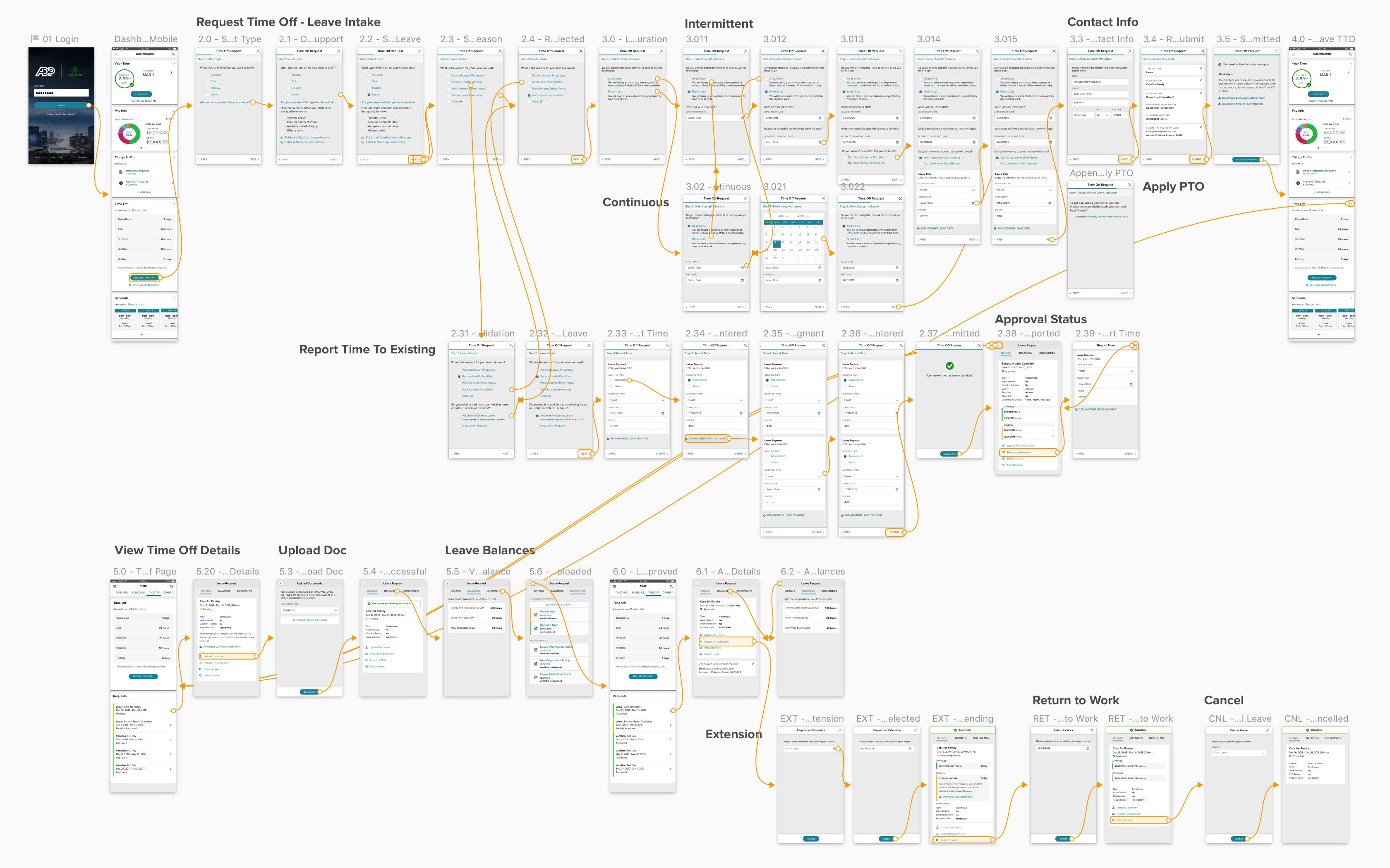
For complicated flows like Requesting Time Off, I created high-fidelity prototypes with Sketch + InVision to show both the happy path and the various branched flows.
Finally, I created vision videos and prototypes to help imagine what could be. This was the case when the UX team wanted to explore what could be possible with voice and chatbot technology.
Key Outcomes
Achieved 20 million registered users
Top 5 Business App in iOS App Store
Increased Existing Client Adoption by 5%
Reduced time on task for timecard approval by 30%
Several new clients implemented for net new revenue